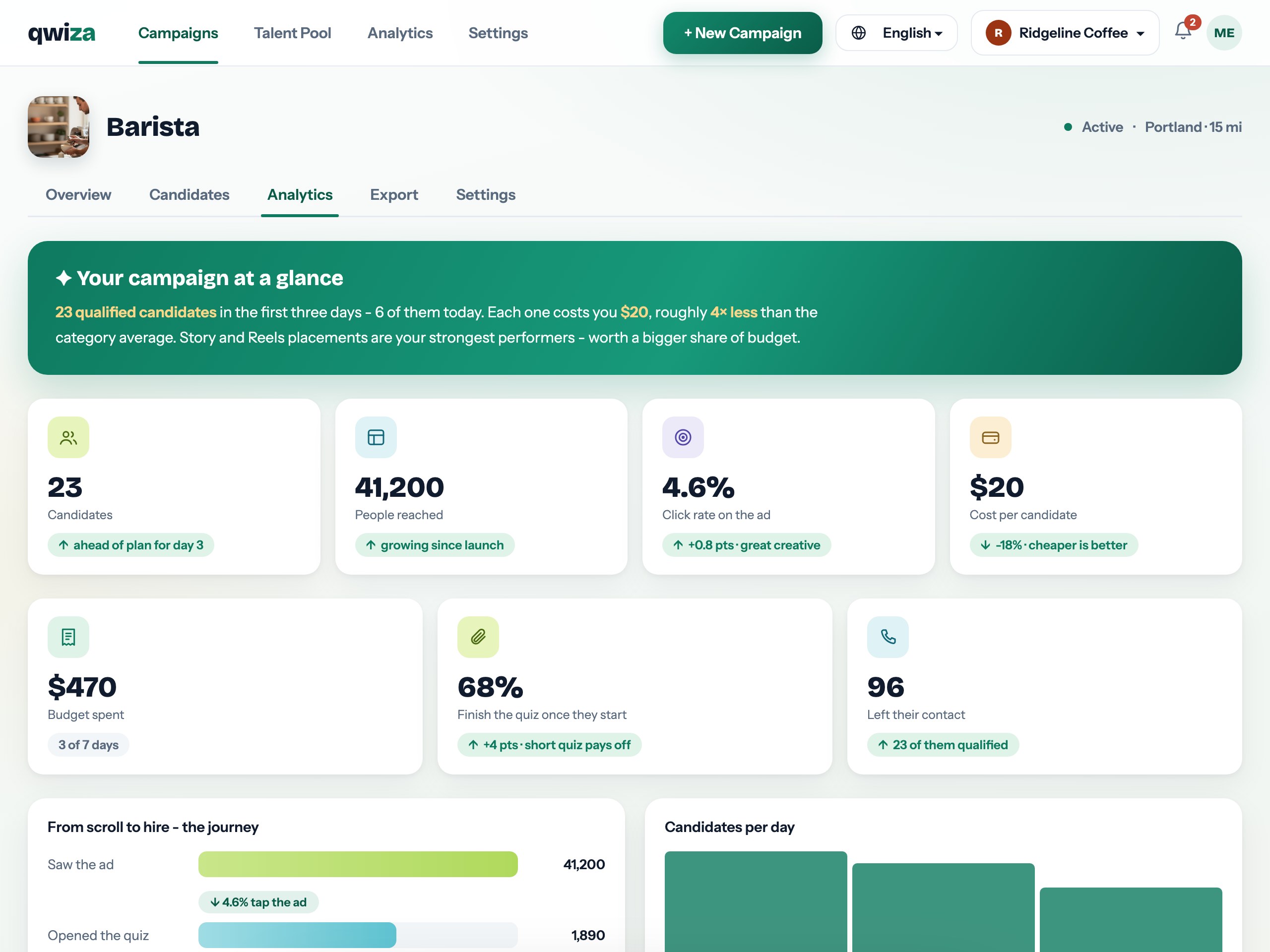
Most recruitment dashboards tell you what happened; Qwiza's analytics also tell you what it means. Every campaign shows the full funnel - reach, clicks, quiz starts, completed applications, qualified candidates - alongside spend and cost per candidate, each with a sentence of plain-language context instead of a tooltip full of jargon.

Reach tells you the ad is being seen; click-through tells you the creative works; quiz completion tells you the questions are fair; qualified count tells you the targeting is right. Qwiza shows each step and - more usefully - flags which step is underperforming and what usually fixes it.
The campaign-at-a-glance strip does the daily check-in for you: candidates so far, budget spent, cost per candidate and how you compare against category averages, in three sentences a busy owner actually reads.

The interactive demo runs the real product across six industries. Two minutes tells you more than any page.

Your advertising budget is spent transparently: what went to Meta, what remains, and what each qualified candidate actually cost. No blended fees hiding inside a media number - ad spend passes through 1:1 and the platform fee stays a separate, visible line.
Score distribution shows the quality story behind the volume: a campaign pulling 300 weak applications and one pulling 60 strong ones look identical in a vanity dashboard - and completely different here.
We use strictly necessary cookies to make this site work. With your consent we may also use preference and analytics cookies. Read the Cookie Policy - you can change your choice any time via "Cookie settings" in the footer.